I love the brush detail of the paint brushes in the first Jim Dine image, also his use of negative space really is brilliantly effective.
Tuesday, 31 January 2012
David Hughes + Jim Dine
Simon was showing us the work of David Hughes and Jim Dine today, as we were working on our drawings of our objects.
Hughes' style is simplistic, but very effective; along with his composition. I love how he concentrates on certain aspects of the piece, such as the bison's head, and keeps the rest of the piece simple. The creme paper makes a huge difference to the style too.
I love the brush detail of the paint brushes in the first Jim Dine image, also his use of negative space really is brilliantly effective.
I love the brush detail of the paint brushes in the first Jim Dine image, also his use of negative space really is brilliantly effective.
Monday, 30 January 2012
Thursday, 26 January 2012
Shining twins in progress
These are the shining twins before and after the background shading, i had trouble getting the perspective right on the pictures on the wall so i had to tippex them out, which ruined it a bit.
Charles Dana Gibson
Gibson was a big influence for my final pen and ink drawing of the twins from the shining. I used his technique of sideway lines for shading on the figures, and in the background.
Michael Hunter
This is a multiplicity photograph by Michael Hunter, which is supposed to represent the last supper, quite impressive!
Monday, 23 January 2012
Twins photos
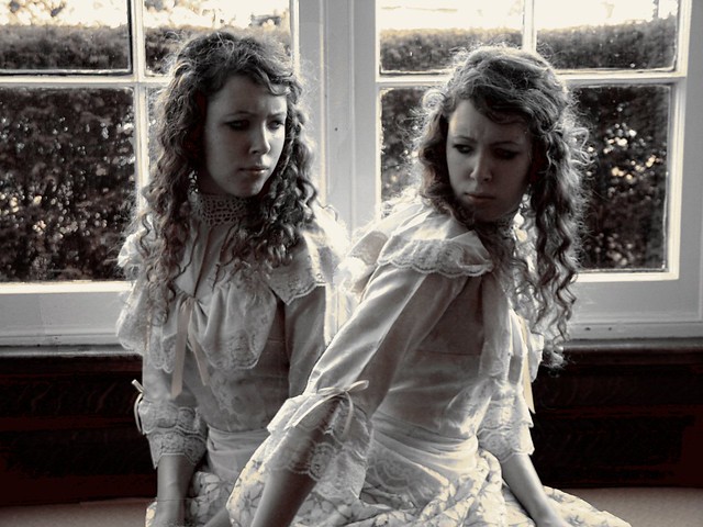
I thought this would be a good idea, i have tried to re create relationships between twins, by editing two photos of me together
Subscribe to:
Posts (Atom)


